Your blog post
Blog post description.
3/1/20263 min read
My post content
If you've spent more than five minutes in the junk journal community, you've heard the word ephemera. It's everywhere — in supply hauls, in swap groups, in the captions of every gorgeous journal page you've ever saved to a Pinterest board. But what does it actually mean? And more importantly, what makes some ephemera feel genuinely beautiful and others feel like filler? That's worth unpacking.
Ephemera: The Original Disposable Art
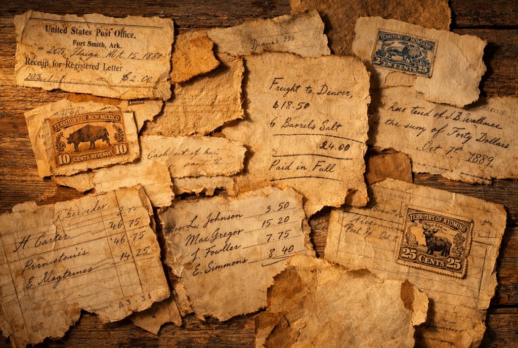
The word ephemera comes from the Greek for "lasting only a day." Historically, it referred to printed materials that were never meant to be kept — train tickets, postal receipts, advertising cards, government tags, store labels, handwritten invoices. These were working documents. Practical objects. Nobody framed them.
And yet, here we are — collectors, artists, and paper crafters who understand intuitively that these scraps of everyday life are among the most honest records of history we have. A ledger page from a frontier mercantile tells you more about how people lived in 1878 than most history books do. A territorial post office receipt, hand-stamped with faded ink, carries something that a polished photograph simply cannot: the texture of real life.
Junk journal ephemera is the modern continuation of that tradition. We gather, arrange, layer, and collage these pieces — original or reproduced — into journals that feel lived in from the very first page.
What Makes Ephemera Work on a Journal Page
Not all ephemera is created equal, and experienced paper artists know the difference immediately. Generic clipart — the kind assembled from stock images with a quick sepia filter applied — tends to flatten out on a journal page. It sits there. It doesn't breathe.
Good ephemera has visual weight. It has inconsistency — the kind that comes from actual printing presses, actual ink, actual age. The typefaces feel right for the era. The aging isn't uniform. There's variation in the paper texture, the ink density, the stamp impressions. When you layer it with other pieces on a journal page, it doesn't fight for attention. It belongs.
This is why the sourcing of your ephemera matters as much as the quantity of it. A single piece of period-accurate vintage printable paper can anchor an entire spread. Ten pages of generic "vintage-style" clipart can clutter one.
Printable Ephemera vs. Vintage Originals
There's a romantic appeal to hunting for original vintage ephemera — the antique markets, the dusty boxes of old correspondence at the back of a shop. That hunt is real, and for collectors, it's half the joy.
But for working paper artists who create journal pages regularly, original vintage pieces have limitations. They're fragile. They're finite. Cutting into an original document — however glorious it feels — means it's gone. And the best pieces are increasingly expensive, increasingly rare, and increasingly fought over by collectors who have no intention of gluing them into a journal.
Printable ephemera solves that problem elegantly. When a design is researched against real historical references — the actual typefaces, stamp formats, and aging patterns of the period — and reproduced at print-ready quality, it gives you the look and feel of genuine vintage material without the scarcity. You can print it once, or print it a dozen times. You can cut it freely, layer it boldly, and use it without hesitation. That freedom changes how you create.
Michelle, who journals regularly using pieces from our collections, puts it simply: once she stopped treating her ephemera like it was too precious to use, her journal pages became dramatically more interesting.
Building a Cohesive Journal Page with Vintage Ephemera
One of the most common struggles new junk journal artists face is the "cobbled together" feeling — a page that has a lot of interesting pieces but doesn't quite cohere. This usually comes down to two things: tonal range and design language.
Tonal range means the color palette of your pieces. True vintage ephemera tends to live in a narrow range of warm ochres, faded browns, dusty creams, and muted blacks. When all your pieces share that palette, they unify automatically. Problems arise when modern-looking clipart — even if labeled "vintage" — introduces clean whites, bright colors, or harsh blacks that don't belong in the era.
Design language means the style of the typography, the shape of the tags and labels, the format of the stamps. Frontier-era ephemera has a very specific visual vocabulary — condensed serif typefaces, decorative borders, handwritten annotations, official-looking seals and stamps. When your pieces share that vocabulary, the page feels like it came from somewhere real, even if every piece is a printable.
The goal isn't historical accuracy for its own sake. It's visual coherence — a page that feels like it belongs to a specific world.
Junk journaling is, at its core, a form of visual storytelling. The ephemera you choose determines the story your pages tell. Timeworn, period-accurate pieces — the kind that could convincingly have been pulled from a depot archive or an old courthouse file — give your journals the weight and character that make people stop and look twice.
If you're building a collection of vintage printable ephemera that takes historical accuracy seriously, browse the current collections at Weathered Canvas Studio. Every piece is researched, revised, and held to one standard: does it feel real?
Weathered Canvas Studio
Vintage ephemera & printable journal kits for junk journals, scrapbooks, and creative paper artists.
Contact
Newsletter
support@weatheredcanvasstudio.com
© 2026. All rights reserved.
FAQ